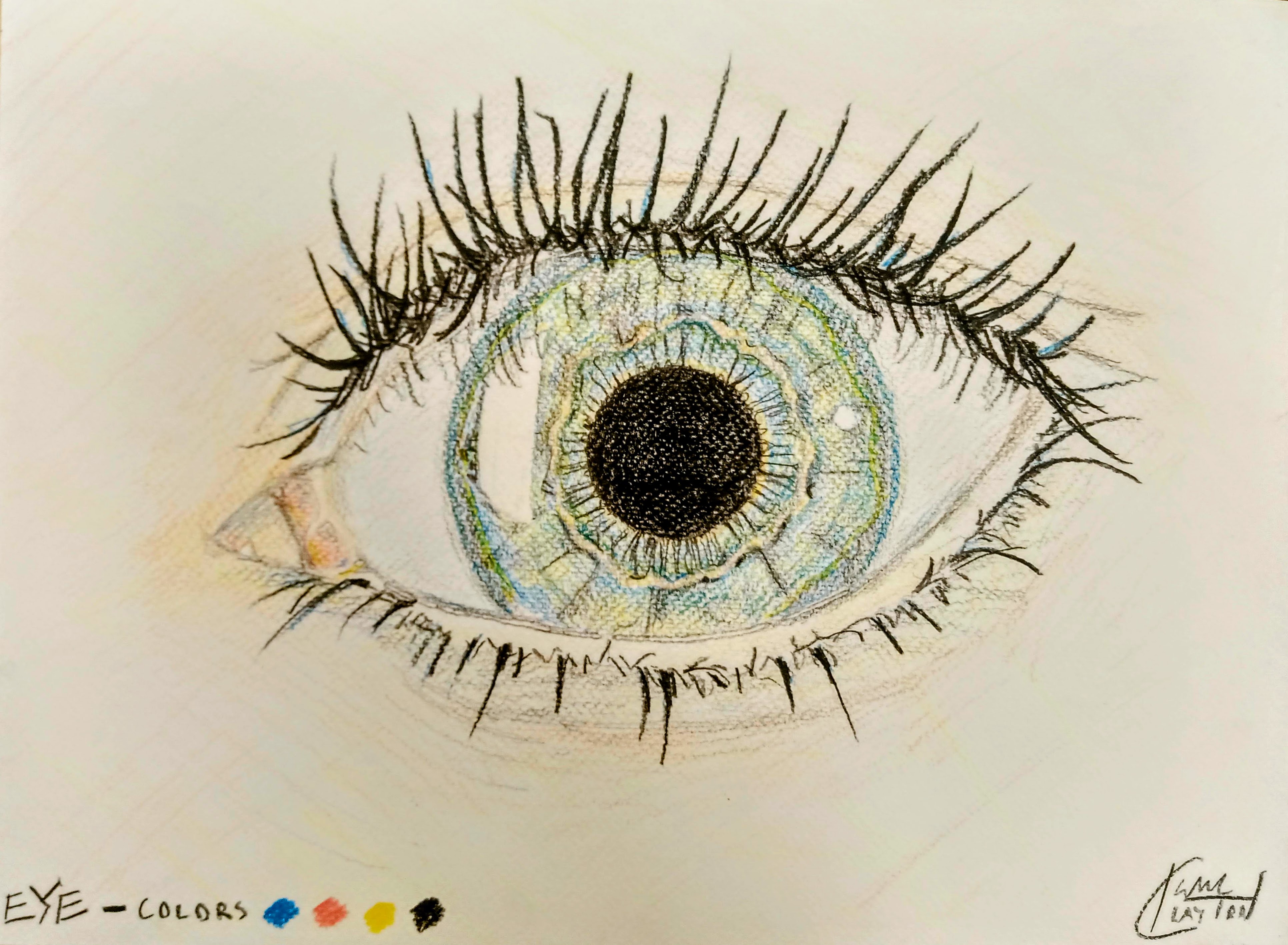
Isaac Clayton (2021) · Color pencil on paper, A3 · Rome, Italy

Red, Yellow, Blue. These are the oft-repeated primary colors, but they are only a half-truth.
There are really two sets of primary colors; which one to use depends on the type of light you’re working with. For additive light, like that emitted by screens, the primary colors are Red, Green, and Blue — RGB.
The physical medium, on the other hand, is subtractive. Adding colored pigment to paper removes a fraction of the light being reflected off it. The primary colors of subtractive light are Cyan, Magenta, and Yellow (and Black) — CMYK.
It’s funny, then, that artists stick to Red, Yellow, and Blue. Artfully selected primaries create nuanced mood; why do we leave a fraction of the spectrum unexplored?
In this piece, I used only the 4 subtractive primaries, as seen in the bottom-left corner. This was a fun exercise in pulling out the components of colors, carefully mixing opposites to create a perfect shade in the middle.